I find the coolest friends in the comment section! I always love where your words lead me, and this time my serendipitous clicking took me straight to Shaleah Soliven’s interior design site. I found her aesthetic flawless and so friendly and mighty intentional on many levels. Of course, I wondered if Shaleah’s personal design was half as spectacular as her professional work, and couldn’t wait to see how her young daughter, Sydney, fit into the surely-elegant Soliven home. You’ll be as pleased as I was to find that Sydney doesn’t fit in the space; she flows through it. Please enjoy the tour!
We are a family of five. Well, actually just three if you don’t count our Chihuahuas Mars and Cola, but five sounded like more fun for a second! I have a husband named Vince, who is an art director for an ad agency. He expresses his talents in so many ways, including photography, illustration, and really anything design-related. He even illustrated a book you may know, called Everything Is Better with a Gorilla. And best of all, he is my biggest fan, supporter, and motivator.
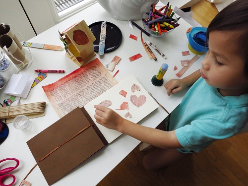
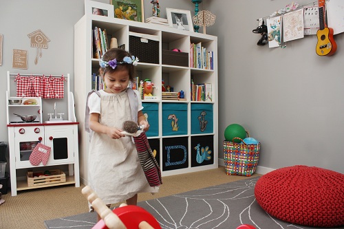
Sydney is our two and a half year old little lady. She is super laid back and always busy, if that make sense. Syd loves gymnastics, painting, any craft that involves glue, princesses, tutus, the park, dancing, music, and strumming the guitar at the end of our hallway every now and then. Plus anything tiny, from animal erasers to little seashells. Knowing that, we started a dollhouse renovation project together. And of course, she became obsessed with all the little dolls and furniture. We’re starting her young! Syd’s easy-going personality has allowed us to take her everywhere, including a road trip from Chicago to Los Angeles, and even a weekend at Pitchfork Music Festival last summer. We had a blast.
Lastly, I’m Shaleah, a stay-at-home mom. Although I do miss my career as an interior designer specializing in hospitality, being Mom is my favorite job to date. And sharing my love for design with our daughter is one of the best things about it. While I still dabble in the occasional residential design job, doing creative projects around the house with Sydney fulfills my creative needs.
Together, we love the outdoors and anything travel or adventure related.
We currently live in Chicago, the vibrant city we both love and also where we first met. We were living in LA for a few years, but made the move back to Bucktown, our favorite neighborhood, after having Sydney. It’s a hip area where it’s easy to park on the streets and access the main freeways, and just a ten minute walk to the train. If it were up to Sydney, we’d be actually on the train every day.
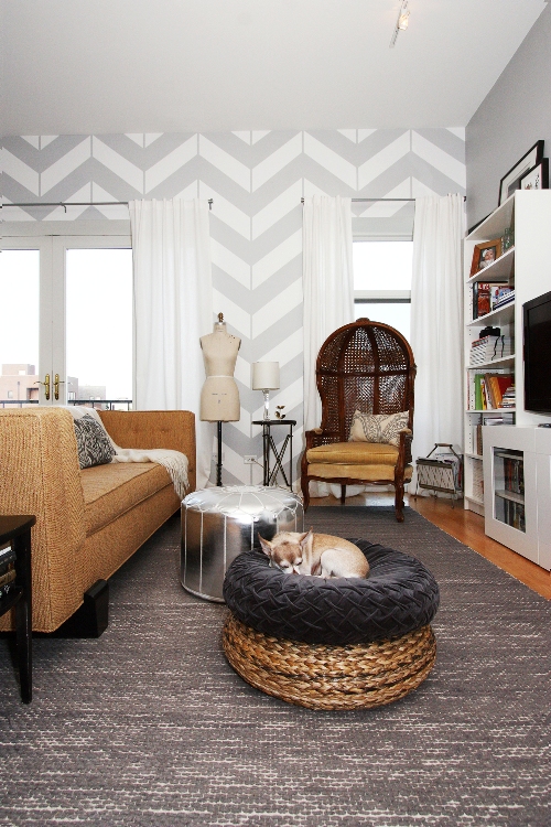
Although we’ve always appreciated the details and nuances in old Chicago buildings, we were drawn to this newly renovated place. We fell in love with the apartment because of its high ceilings, open floor plan, and spacious rooms. Upon first glance, we could already see friends and family gathering around a long dining table, and Sydney riding her tricycle around the house. And then, there’s the beautiful view. We can see the Chicago skyline from every room of the apartment. The sunlight floods the entire space during the day. It’s just perfect for us.
I do like design that’s intentional. Everything should have a purpose and be functional. Our home is designed to accommodate our daily routines while allowing us to do the things we love to do.
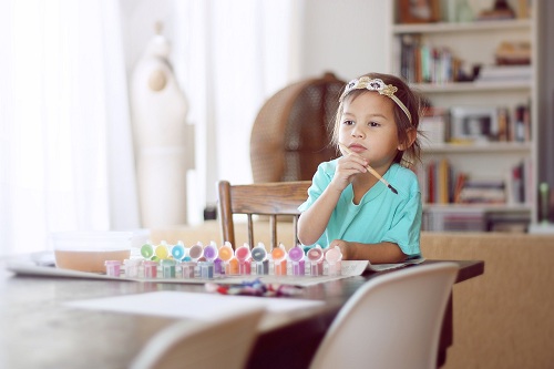
I loved crafts, painting, and drawing when I was a kid, so I provided Sydney with all the same supplies and activities that I enjoyed as a kid. I also wanted to encourage and promote independence and creative thinking. With all her supplies in reach, she can choose what she wants to do on her own terms. Every day, I come up with art projects and activities for her. But if I’m preoccupied, she can entertain herself without plopping down in front of the television.
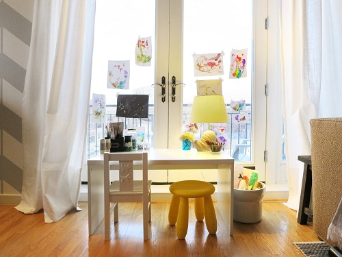
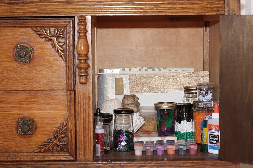
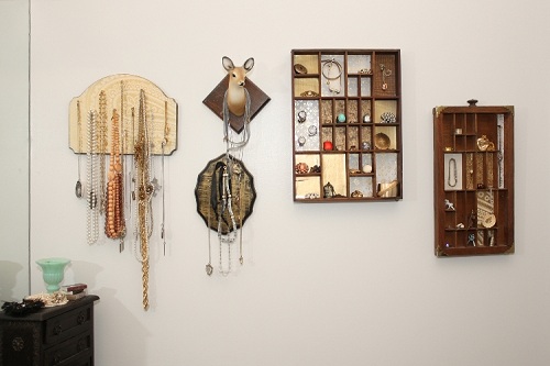
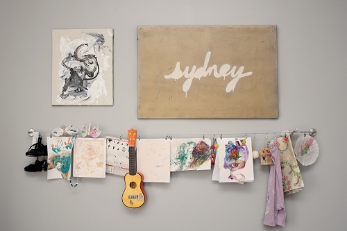
I also let her personality and day-to-day activities shape our space. Like her desk area, for example. One day, my husband brought it out of her room so she could do her crafts while he worked at our desk. It was meant to be temporary, but seeing it in the main living area made so much sense. I found a place for it next to the French doors that overlook the street below, and added items from around the house to make it feel like it belonged there. It’s her own little window office, or window studio, if you will. Nearby, she has a space in our buffet just for her art and craft supplies.

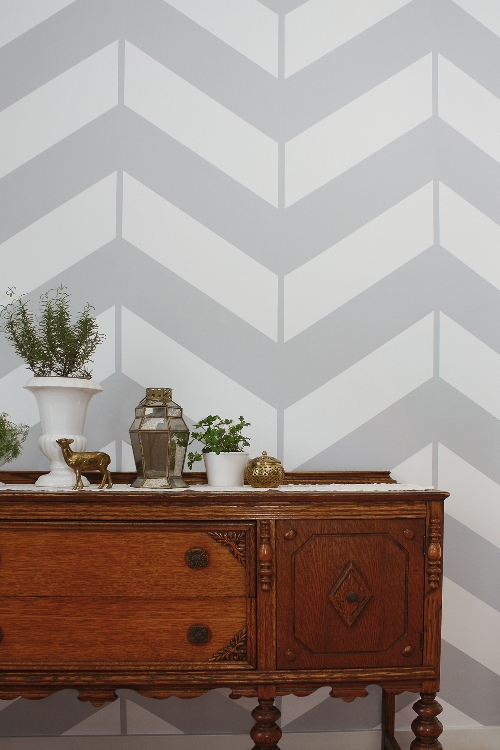
Our chevron wall is painted! I have a soft spot for fantastic wallpapers, but since we currently rent, that wasn’t an option for us. A painted pattern was the next best thing.
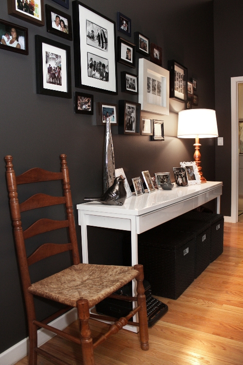
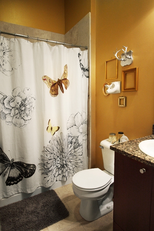
When choosing paint colors, I wanted each room to have its own identity while also working together as a unified aesthetic. So we stuck with an overall neutral palette on the all walls. The main living area is a light gray, our bedroom is navy with gold and white in the bathroom, Sydney’s room is gray, Sydney’s bathroom is a gold metallic paint, and the hallway/entry is dark charcoal. Boldly quiet is the perfect description! Even though they’re neutrals, the navy, dark gray, and metallic gold all make a statement. I actually painted the hallway when my husband was out of town. He never would have gone for it based on a paint chip. But once he walked in and saw it, he instantly fell in love with the color.
My secret to picking colors…hmmm. My first advice is to make use of all the great neutrals out there, and not just white and beige! Almost any color grayed out can be a neutral. As I previously mentioned, colors like navy and a dark gray are neutral but can have a powerful visual and emotional impact in a room. It’s also really important to look at all the colors together before making decisions. Undertones can make a paint color look a little pink, yellow, blue, etc. Lighting also affects how a color looks in a room. This applies to all neutrals, and even colors. Don’t forget to think about how all the colors work together in a house. For example, if you’re standing in a living room and you’re able to see the kitchen and dining room, it’s essential that all colors in these rooms work together. And don’t be afraid of color. Take a risk with the walls, and go with something dark or bright. Remember, like everyone always says, you can always paint over it.
Lastly, I always suggest grabbing a bunch of the same color paint chips, taping all of them up on a wall together, and get a feel for the color for a day or two. See how they look in the room at different times of the day.
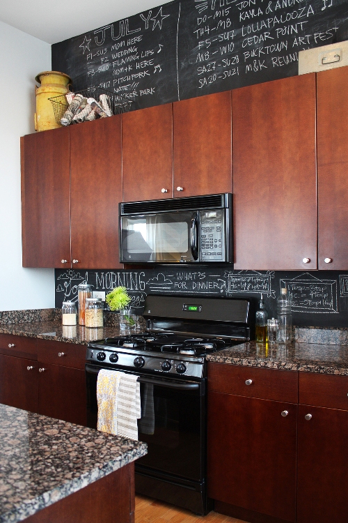
I would totally recommend a Chalkboard back-splash in the kitchen. If there are any oil splatters, just wipe it down with a wet cloth. Sometimes we change up what’s on the back-splash. Recently it’s become my cheat sheet of conversions and measurements. When I’m in the middle of cooking and I need to know how many tablespoons are in a third of a cup, I can just glance at the wall. To make these notes look nice, they’re all written in little hand-drawn frames.
We often change the writing above the kitchen cabinets. This past summer we had a lot going on, so we turned that area into a giant calendar. We even draw seasonal illustrations. Which reminds me, it’s probably time the snowflakes and penguins get erased and replaced with a spring scene!
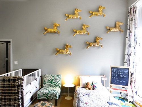
Sydney’s room has been so much fun to work on, and it’s still not done! We recently found the horses at a local flea market and just painted them gold the other weekend. They feel so dreamy and playful, while the gold color gives them a sense of sophistication. I adore them.
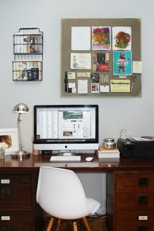
I’m a sleuth for good deals and enjoy making things on my own. One of my favorite DIY projects is the bulletin board above our desk. I couldn’t find one that I liked in our space, but when I saw the metal screen in an aisle at Home Depot, I knew it belonged in our house. When layered with painted Homasote, it became the perfect pin board.
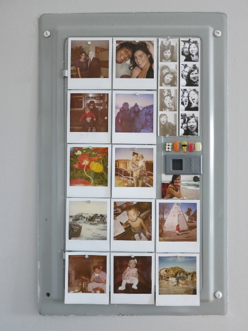
And this one is so simple I don’t even know if I can call it a DIY project, but I’m proud of my fuse box solution. One day, I was trying to come up with a design solution for a project, and my husband said “If there isn’t a good way to hide it, just embrace it and make it work in the space.” I applied this thinking to the fuse box problem. It is what it is; a piece of metal that just so happens to make the perfect magnetic picture board.
Having an open layout is so great, especially if you have kids. That’s why the main living area is my favorite. So many different things can happen at the same time in one room. I can be cooking, Vince working on the computer, and Sydney at her desk or practicing her forward rolls on the rug, and we are all still together. It’s also fantastic for entertaining, which I love to do. This area is the heart of our home, and it’s the perfect combination of serious and fun.

Having kids doesn’t mean you have to compromise design. It just means you have to think about it a little more. When we first had Syd, we did start to baby proof our place. We actually put those hideous bumpers on our coffee table. Then we tried taking them off, and of course, the finish came off with it! We tossed table, and I vowed to never do anything like that again.
Instead, ditch the coffee table and replace it with ottomans. They’re great for lounging and soft for the little ones. Add a tray if you need the hard surface.
Toys can be stored in the living room, but find bins or baskets that work with your design and are pretty to look at. You just have to think outside the box, no pun intended! These kinds of design solutions work for everyone. Kids and adults.
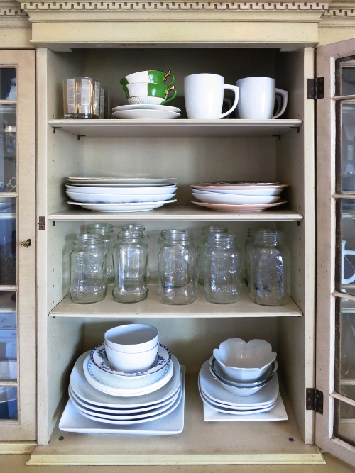
All the major pieces of the room should be useful and have a purpose. We store art supplies and Vince’s camera equipment in our antique buffet, everyday dishes in the top half of the china cabinet, and my sewing supplies below. These pieces of furniture are pretty to look at, and we use them and the items in them every day.
Rather than displaying a bunch of art pieces and pretty things, I believe that the functional items in your rooms—the cabinets and storage furniture—should create the visual interest. And I think you have to find an eclectic balance between whimsy and sophistication; it helps to blend the adult and kid stuff.
After Syd came along, I also learned to look at our home in levels. There’s the lowest level that is Sydney friendly, the middle, which is Sydney accessible with a stool, and then the no little hands allowed level at the very top. I wanted our place to look and feel like a child lives here, not ‘Oh, these people have a kid.’ It needs to be as much her home as it is ours.
Traveling always inspires me. But browsing the web gets me going, too. There are so many good ideas out there, and after an hour or so of getting lost admiring other peoples’ ideas, I get inspired to grab my notebook and pencil, and start sketching and coming up with my own ideas and design solutions.
To be honest, I don’t really have a favorite go-to place shop. When shopping for furniture, I usually know what I want and I hunt for it. I do love me a good thrift shop, though! There are lots of overpriced and over-picked ones, especially in the city, so I like to rummage through some good ones whenever we visit my mom in Ohio. I actually like thrifting so much that I’m working on my very own Etsy Shop, where I can sell all my great finds. And Craigslist can turn up some great pieces. That’s where I found the canopy chair in our living room that I picked up for a hundred bucks. Score!
But if I did have to name a favorite store, it’s Jayson Home.

The table that is now in our hallway was originally intended as a desk. I figured we had a large dining table to work at, so a narrow desk where my husband and I could work side by side would suffice. But a 27-inch iMac almost destroyed my vision in one sitting. Needless to say, it was replaced by a large and practical desk.
We also had a white pin tuck duvet on our bed. Don’t get me wrong; I love this look, but it’s just not the best when you like to tickle your daughter in bed and let her jump around. Those cute little pin tucks eventually become nonexistent.
I wish I had known sooner how inexpensive it can be to make a rental feel like a well-designed home. With every apartment before this one, I always thought it wasn’t worth trying to design it as if it were a home we owned. I think people would be shocked at how little we spent on our place. You just have to be patient while searching for the right pieces, keeping aesthetic, budget and flexibility in mind. You can’t just furnish a place in one weekend. That’s when you’ll find yourself settling for the best option in the store rather than finding the right piece for your home. And you’ll probably spend a ton.
—-
Thank you, Shaleah. You’ve given us such useful reminders, from reconsidering neutrals to rethinking rentals. It’s stuff like this that sends us to our paint shops and prompts us to stare at empty walls for an entire afternoon, right?
I think one of the elements that turns a home into something spectacular and refreshing is the not-so-simple act of taking a chance. Asking yourself “Why not?” instead of telling yourself all the reasons why not is a start, don’t you think? We hear it all the time in these interviews; it’s just paint and it’s just a few more holes in the wall and it makes perfect sense to have their little desks near our own. It’s all very true. So tell me: What’s the one project that’s living in your dreams, but not in your home? Yet.
P.S. — You can find all the homes in my Living With Kids series here. If you’d like to share your home with us, drop me a note. I’d love to hear from you!